BESTBUY.COM PURCHASE HISTORY
Designing a new digital online experience for in store purchases
Best Buy is a leading provider of technology products, services and solutions. Whether customers visit their stores, engage with Geek Squad agents in their homes, or use BestBuy.com or the Best Buy app, Best Buy works to enrich the lives of their customers through technology across a range of areas, including entertainment, productivity, communication, food, security and health.
Background
Objective
During my time as a UX Designer on the Profile Product Team at Best Buy, I was given the responsibility of designing a brand new digital experience where users could view all of their Best Buy purchases—both in store and online—in one place within their online account. While online orders were already available in the user’s account, in store purchases were not. This experience also aimed to present a users’ purchases on more of an item level rather than a transaction level.
Defining the Page Structure Through Iterative Concepts
I started by trying to define the page structure by creating multiple layout concepts in high fidelity wireframes. The biggest challenge I had was trying to figure out where to place and how to represent the Write a Review and Buy Again call to actions.
While I thought the strongest concept was option 4 (please see below) technical limitations prevented the rating stars from working the way I had designed the interaction.
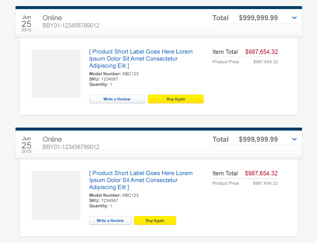
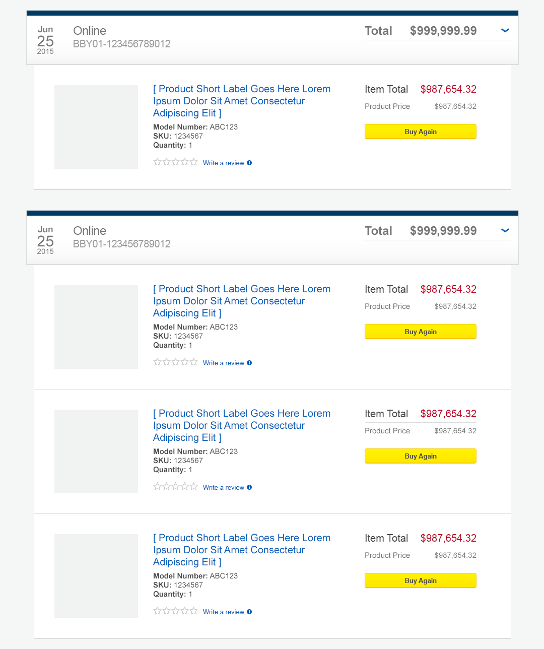
Since the ideal concept wasn’t going to work, the next strongest concept, option 2, was chosen instead.
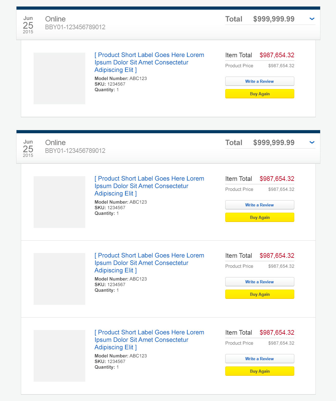
A couple of modifications were made from the original concept:
The Buy Again button appears first above the Write a Review button
This way, the Buy Again button groups with the price of the item, and it is also the more important, or primary, action of the two
Buy Again became a blue button instead of a yellow one
Yellow buttons are reserved for transactional interactions, like Add to Cart or Checkout. Because an item may have been on sale at the time of the original purchase, the Buy Again button actually takes the user to the product details page (PDP) rather than adding the item directly to the user’s cart. Since the button doesn’t perform a transactional interaction, it shouldn’t be yellow.

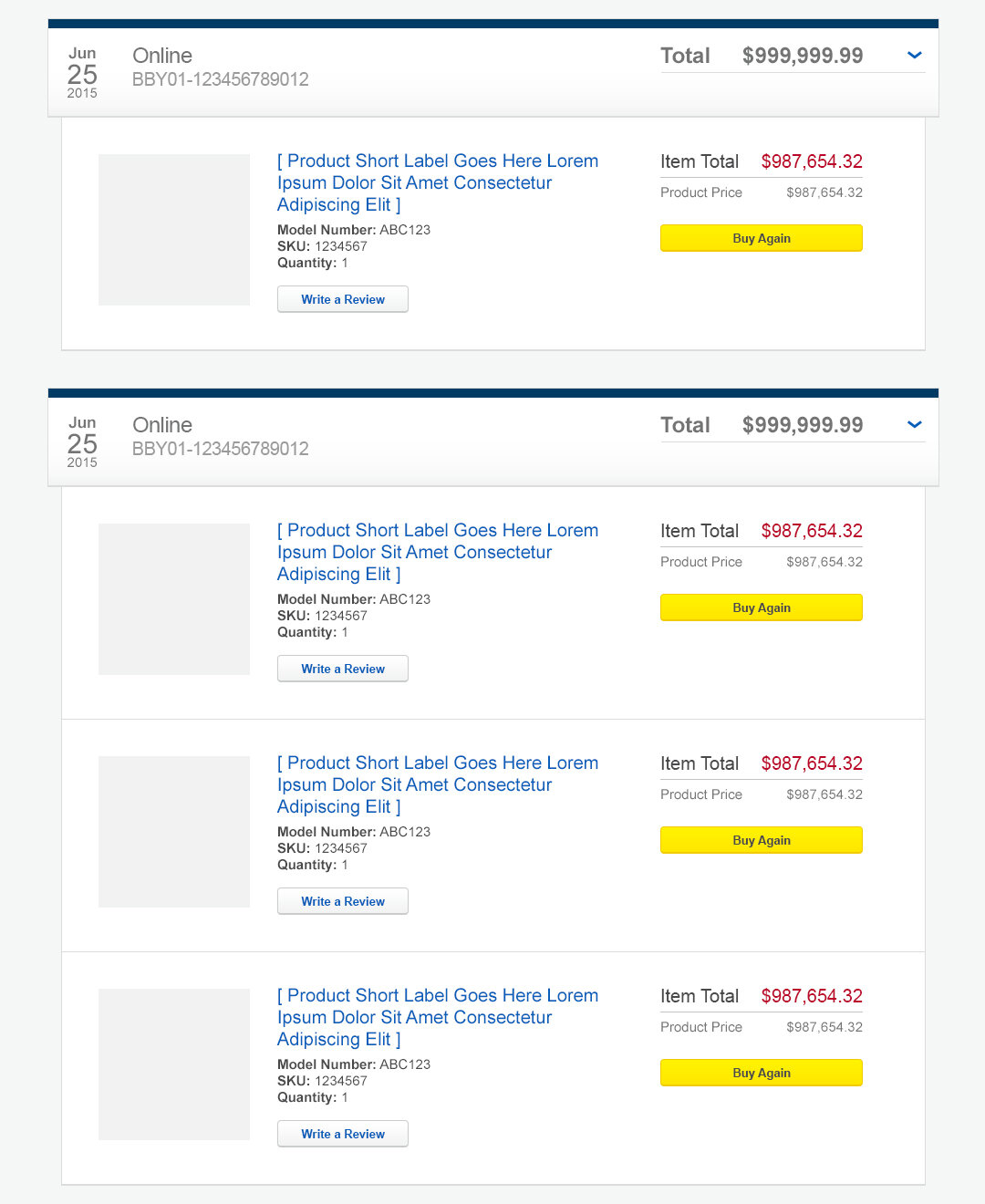
Final direction (high fidelity wireframe)
Releasing the first Iteration
After choosing a final direction, the team began getting ready to release the first iteration of the experience. The scope of the minimum viable product (MVP) was to simply present all of a user’s purchases, both in store and online, in one place within their BestBuy.com account. Because the intent of this experience was to present a user’s purchases on an item level rather than just a transaction level, all of the items in each purchase were meant to be displayed at the same time (LEFT); this would make it easy to scan if a user was looking for their purchase of a specific product.
However, this caused performance issues with the loading of the page, so I had to come up with an alternative solution. The ability to expand (Show Items) and collapse (Hide Items) for each purchase was added, and a compromise was made so that the first (most recent) purchase was expanded on page load while the rest of the purchases on the page were collapsed (RIGHT).

LEFT: Original MVP design

RIGHT: MVP that went live
Eventually, the problem that was causing the performance issue was resolved, and in a later release, the display of the items in each purchase was implemented per the original design.

Original MVP design
Enhancing the experience incrementally
After the initial launch of the experience, it was enhanced incrementally with additional features. Functionality like return to top, filtering purchases, displaying discounts and shipping costs, associating service plans to parent products, and declaring when items have been returned were added over time to improve the experience.
When it came to designing how to display returns, I went through a similar process that I did with my initial concepting of the MVP experience, designing multiple potential solutions. While I thought visually option 2 (please see below) was the most compelling, I had concerns about the legibility of the “Returned” text depending on the image of the returned product, so I moved forward with option 5 instead.
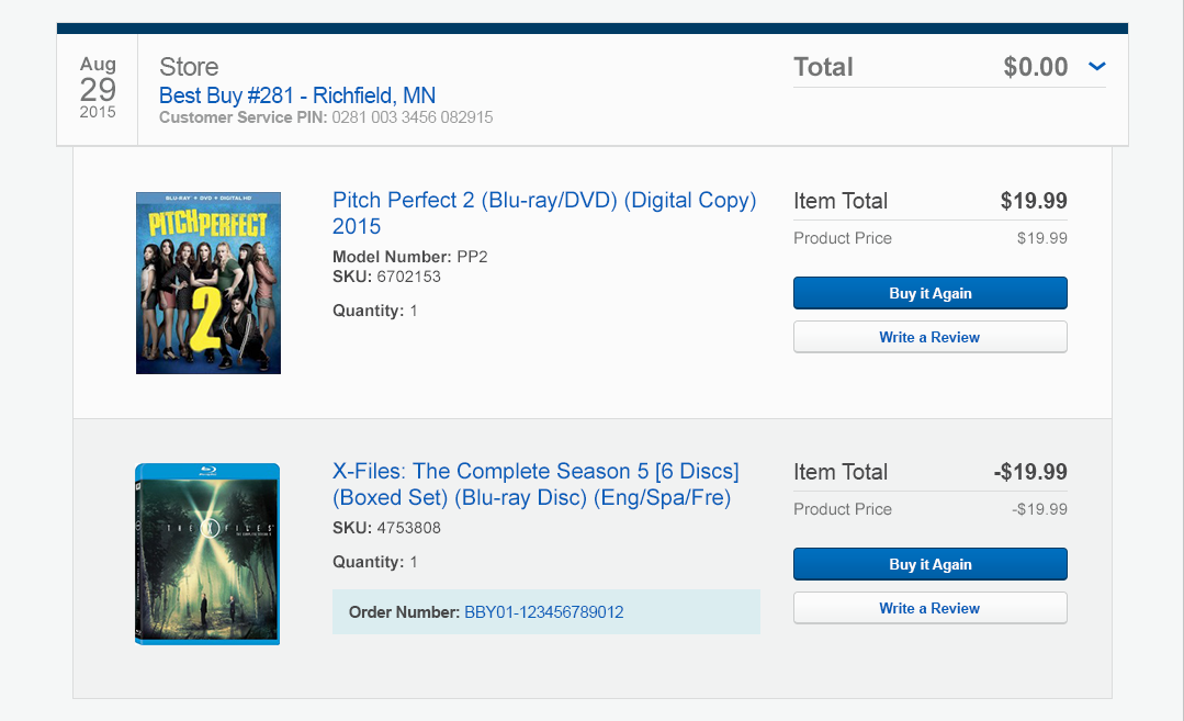
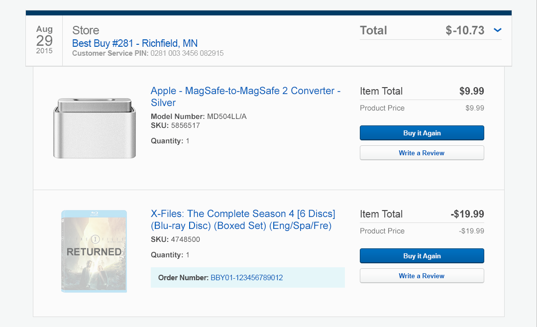
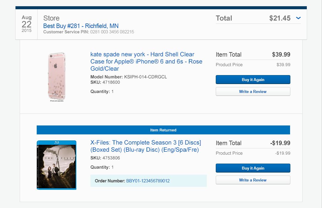
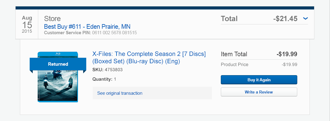
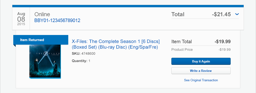
Option 5 was based on a pattern that I had previously designed to designate primary/preferred user information within the BestBuy.com account, so it made sense to leverage an existing pattern for consistency throughout the account experience.
However, some modifications were made to my original concept (please see below). The color of the “ribbon” was changed from blue to gray to call less attention to it since it was referring to a returned product, and the width was adjusted so that it was determined based on padding around the words “Item Returned” rather than aligning to the responsive grid as I had originally designed.

Returns: final direction
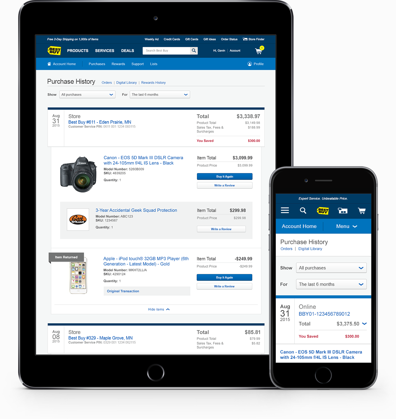
Bringing it all together
Below is the final design with all of the features built in.

Final design (desktop)

Final design (mobile)